Music Video Final Draft
Tuesday, 27 December 2016
Tuesday, 13 December 2016
Ancillary Shooting Schedule
For our ancillary products we plan to take the majority of the pictures on Tuesday 13th December during period 1 and 2 of school in the morning. These pictures will include all of the shots including the band members: a close up of Chris with a fence behind him, a long shot of Michael sitting on the wall and a long shot of me walking away from the camera with a guitar. We will also get the individual mid shots which we will add together in editing in the front cover of the album and advertisement. We plan to get the other shots such as the shots of the cranes on the tram track at a later date.
Monday, 12 December 2016
Ancillary Products Plan
Digipack for the album:

Advertisement for the digipack:

The front cover of the album and advertisement features almost exclusively just the three band members in a mid shot. This was done to keep a focus on the band members and to allow the audience to connect and relate to them, and means that they will be seen more therefore growing the band image and brand and making them more known. It also allows for the audience to easily relate the band with the music. The design is fairly simplistic and not overdone, in conjunction with the fairly ordinary costumes, developing the idea of the band being normal people, making them more relatable. It shows the band to have no gimmicks and with a strong focus on the music. The inclusion of the cranes links the digipack and advertisement to the music video and also helps with a consistent star image as well as adding more of the indie pop genre feel as it is quite unusual, fun and unique. The idols above the heads of the band members adds some interesting colours and effects and resembles the idols used in the video game The Sims, attracting the younger target audience as we are relating the band to concepts that they are already familiar with and enjoy.
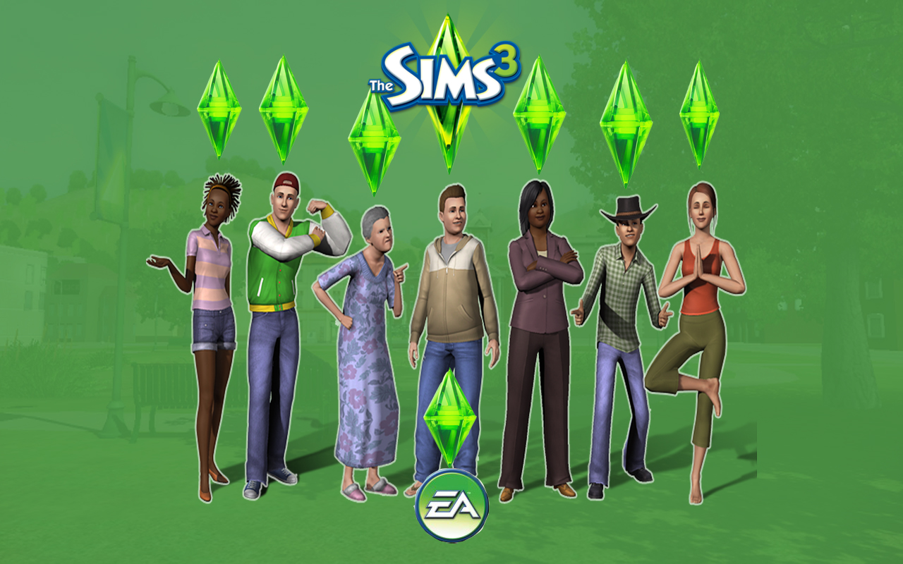 |
| Example showing idols used above characters heads in The Sims 3 |
Wednesday, 7 December 2016
Retrospect Mood Board
Mood Board for Retrospect
This mood board contains a collection of images found online on the site 'Pinterest' that give a basis to the look and feel wanted to be created by our own music video. Most of the ideas include the ideas of the somewhat calm and solidarity of the rural areas, including nature and wildlife, giving an idea of freedom and ruggedness. Other ideas include the retro or hipster visuals working with the indie genre and exhibiting a visual declaration of being different with alternative viewpoints and attitudes. Along with this, the concept of having a passion for the music is also frequent. We aim to to this in order to appeal to our target audience of 15-25 year old females.
This mood board contains a collection of images found online on the site 'Pinterest' that give a basis to the look and feel wanted to be created by our own music video. Most of the ideas include the ideas of the somewhat calm and solidarity of the rural areas, including nature and wildlife, giving an idea of freedom and ruggedness. Other ideas include the retro or hipster visuals working with the indie genre and exhibiting a visual declaration of being different with alternative viewpoints and attitudes. Along with this, the concept of having a passion for the music is also frequent. We aim to to this in order to appeal to our target audience of 15-25 year old females.


Friday, 2 December 2016
Creating Our Props
Making The Cranes
After we had filmed some of our planned shots and edited them together, we realised that we wanted to add another unusual aspect to our music video that fit with the indie pop genre. We thought that we could do this by using props in the form of origami cranes. This meant that we needed to make these cranes. To do this we asked one of our friends who knew how to make them to teach us and we then made 4 origami cranes out of different coloured paper.

After we had filmed some of our planned shots and edited them together, we realised that we wanted to add another unusual aspect to our music video that fit with the indie pop genre. We thought that we could do this by using props in the form of origami cranes. This meant that we needed to make these cranes. To do this we asked one of our friends who knew how to make them to teach us and we then made 4 origami cranes out of different coloured paper.

We were going to use these cranes to create a slightly more complex narrative and to use them to create meaning through the association with the band members. The cranes were going to be used in the shots of the rural locations and we had a few shots in mind including them, for example setting one to travel down a stream which we filmed on Sunday 4th December. We also wanted to use these cranes in our ancillary work and therefore would have to make some more in the future.
Inspiration
Drawing Inspiration For Our Music Video
When looking for inspiration for our own music video, we mainly looked at the interesting aspects from the music videos of Lana Del Rey - West Coast, The 1975 - Chocolate and The 1975 - Robbers.
This was because we liked the styles of these music videos and how the exemplified the indie pop genre. We also thought the star images were shown in an interesting and effective way, and thought that we could use some of these aspects in our own music video.
This was because we liked the styles of these music videos and how the exemplified the indie pop genre. We also thought the star images were shown in an interesting and effective way, and thought that we could use some of these aspects in our own music video.

We liked that the Lana Del Rey - West Coast video was in mostly black and white, along with it including some home-footage styled shots throughout. Also, we liked the star image of Lana Del Rey's seemingly chilled out persona with her on a beach location and in a vintage car. Other aspects such as the contrasting fire and vivid red dress used at the end of the video to give a shock factor and to be unique. Drawing inspiration from this, we wanted to make our music video mostly black and white with some colour and use some similarities in the star image.

From The 1975 - Chocolate video we also liked the black and white colour choice along with the majority of the shots following the lead singer Matt Healy shown doing actions such as smoking and showing his rebellious nature in locations such as tunnels and cars with the use of interesting and effective lighting. All of which we intend to use in our video in some way. A particular shot that we liked was the shot in the dark room with all of the band members sitting in a circle facing out with a pan around them with one intense bright light in the background. We look to implement something similar to this in our own music video.
Another music video we got inspiration from was The 1975 - Robbers. This was because we liked the variety of interesting and effective shot types used in this video along with there being an engaging narrative that shows the rebellious star image and the hardships that the character faces in his life. In this music video there are lots of shots which are we found very interesting in that they were framed well and capture a unique dark tone and atmosphere whilst still remaining visually pleasing and intriguing to watch.
Production Log - 29/11/16
Editing - Production Log
 On this date in lesson time we edited the footage gathered from Thursday the 24th into our music video project on Premier Pro and also altered some of our older footage. We took time to consider the correct positions of these new shots, referring back to our animation and deciding what looks best. We also made some of these shots and previous shots black an white as we felt that this would fit the indie pop genre well as it is conventional of this genre and help create the atmosphere we wanted to fit with the song.
In this editing session we made an effort to add any interesting effects that we thought fitted with our music video well in order to improve some particular shots such as the shot of all 3 of the band members walking across the train tracks. As layering with changing opacity levels was also a convention of the indie pop genre, we wanted to add this effect to this shot. We did this by copying the shot and putting one on the layer on top of another. We lowered the opacity of the top layer so that both could be seen at the same time and then changed the speed of the top layer so that it would give the effect of seeing two of all band members.
In this editing session we also experimented with the 3 way colour effect, using it to bring out certain highlights of vivid colours and leaving the rest of the shot looking dull with low saturation. We used this on the shot shown below to exaggerate the red in the graffiti along with the shot of Chris walking through the tunnel. We animated this shot so that the colours would change as the shot progresses to add some dynamic editing to our music video and help create interest in the audience through attempting to make the video more visually interesting to watch.

Subscribe to:
Comments (Atom)